


Compare to JavaScript or a JQuery menu pure CSS menu gives better performance. Are you looking to create a horizontal menu with sub-menu for your web applications without using any third-party plugins? If so this example will help you. In this demo app we Created a responsive horizontal navigation menu using pure CSS. This menu works for all browsers like Google Chrome, Firefox and Safari. You can customize this source codes as per your business need.
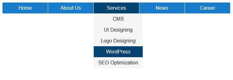
Desktop View:
Mobile View:
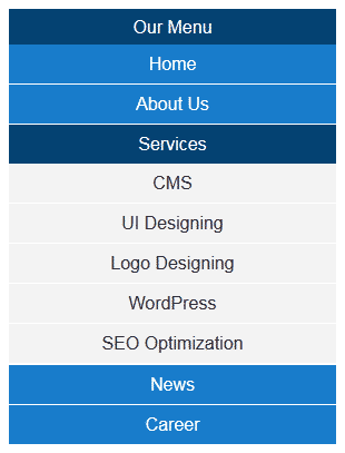
Example of Menu with Sub-menu using pure CSS
In this example I have tabs like Home, About Us, Services, News & Career. You can add or update tags as you want. This menu is supporting sub menu feature. Under About Us & Services I added some sub menu items for demo purpose.
Technically to design this horizontal menu I used UL element of HTML. Using pure CSS I am defining color & theme to the menu. For responsive I used CSS3 media queries. In media query I configured the menu max-width to 750px. 750px is nothing but the total width of my horizontal menu (including all tabs).
This menu is designed using pure CSS, so according to your requirement you can Configure this menu easily. You can change width, height, font style, font color or font size as you want. To update colors & theme you can update background for li & anchor elements. To present mouse over effect here I used CSS hover. To update hover related changes you need to update li:hover related classes.
Horizontal Navigation menu with sub-menu
<!DOCTYPE html>
<html xmlns="http://www.w3.org/1999/xhtml">
<head>
<title>Responsive horizontal menu using CSS</title>
</head>
<body>
<label for="display-menu" class="our-menu">Our Menu</label>
<input type="checkbox" id="display-menu" role="button" />
<ul id="hor-menu">
<li><a href="#">Home</a></li>
<li>
<a href="#">About Us</a>
<ul class="sub-menu">
<li><a href="#">Our Mission</a></li>
<li><a href="#">Technology</a></li>
<li><a href="#">Success Stories</a></li>
</ul>
</li>
<li>
<a href="#">Services</a>
<ul class="sub-menu">
<li><a href="#">CMS</a></li>
<li><a href="#">UI Designing</a></li>
<li><a href="#">Logo Designing</a></li>
<li><a href="#">WordPress</a></li>
<li><a href="#">SEO Optimization</a></li>
</ul>
</li>
<li><a href="#">News</a></li>
<li><a href="#">Career</a></li>
<li>
<a href="#">Products</a>
<ul class="sub-menu">
<li><a href="#">Off-page Optimization</a></li>
<li><a href="#">Blog Writing</a></li>
<li><a href="#">MyCMS</a></li>
<li><a href="#">WordPress Blogs</a></li>
<li><a href="#">Mobile Apps</a></li>
</ul>
</li>
</ul>
</body>
</html>
CSS Source Code for Navigation menu
<style type="text/css">
.our-menu { font-family: Arial, "Times New Roman", Georgia; text-decoration: none; color: #ffffff; background: #054372; text-align: center; padding: 6px 0; display: none; }
#display-menu { display: none; }
#display-menu:checked ~ #hor-menu{ display: block; }

/*Style for horizontal CSS menu*/
ul { list-style-type:none; position: absolute; margin:0px; padding:0px; }
li { float: left; margin-right: 1px; display:inline-block; }
li a { display: block; text-decoration: none; height: 35px; min-width: 145px; text-align: center; line-height: 35px; font-family: Arial, "Times New Roman", Georgia; color: #ffffff; background: #197DCB; }
li:hover a { background: #054372; }
li:hover ul a { background: #f3f3f3; color: #2f3036; line-height: 35px; height: 35px; }
li:hover ul a:hover { background: #054372; color: #ffffff; }
li ul { display: none; }
li ul li { display: block; float: none; }
li ul li a { width: auto; min-width: 120px; padding: 0 15px; }
ul li a:hover + .sub-menu, .sub-menu:hover { display: block; }

/*Media Query for Responsive Design*/
@media screen and (max-width : 750px){
.our-menu { display:block; }
ul { position: static; display: none; }
li { margin-bottom: 1px; }
ul li, li a { width: 100%; }
}
</style>
Benefits of Horizontal Navigation
1. Space Efficiency Horizontal menus occupy minimal vertical space, allowing more room for content. This is particularly useful for landing pages and blogs where screen real estate is valuable.
2. User-Friendly Design Users are accustomed to horizontal menus, as they mimic traditional reading patterns (left to right). This familiarity enhances usability and reduces cognitive load.
3. Mobile Responsiveness With proper design techniques, horizontal menus can adapt to smaller screens, often transforming into hamburger menus on mobile devices.
4. Aesthetic Appeal A well-designed horizontal menu contributes to a clean, professional layout, reinforcing brand identity and visual hierarchy.
Best Practices for Designing Horizontal Navigation
1. Keep It Simple Limit the number of menu items to avoid clutter. Seven or fewer links are ideal for optimal usability.
2. Prioritize Important Links Place high-priority pages (e.g., Home, About, Contact) on the far left, as users typically scan from left to right.
3. Use Clear Labels Avoid jargon—menu labels should be concise and descriptive (e.g., “Services” instead of “What We Offer”).
4. Ensure Responsiveness Test the menu on various devices to ensure it collapses or adjusts appropriately on smaller screens.
5. Highlight Active Pages Use visual cues (e.g., bold text, underlines) to indicate the current page, helping users orient themselves.
Common Horizontal Navigation Styles
Navigation menus are a critical component of web design, guiding users through a website efficiently. Among the various navigation styles, horizontal navigation remains one of the most popular due to its simplicity and ease of use. Several horizontal navigation styles serve different purposes, each with its own benefits and ideal use cases. The most common types include the Standard Menu, Mega Menu, Sticky Menu, and Centered Menu. Understanding these styles helps designers create intuitive and user-friendly interfaces.
1. Standard Menu
The Standard Menu consists of text-based links arranged in a single row, typically placed at the top of a webpage. This style is straightforward, making it ideal for websites with a limited number of pages or sections.
Key Features
– Space-Efficient: Fits neatly in the header without overwhelming the layout.
– Clear Hierarchy: Directly displays primary navigation options.
Best Use Cases Standard menus work well for small business websites, portfolios, and blogs where navigation requirements are minimal. They ensure quick access to essential pages without unnecessary complexity.
Limitations
– Not suitable for websites with numerous categories or subcategories.
– Limited space may require dropdowns for additional links, which can complicate usability.
Despite its simplicity, the Standard Menu remains a reliable choice for many websites due to its familiarity and ease of navigation.
2. Mega Menu
A Mega Menu is an expanded version of a dropdown menu, displaying multiple columns of navigation links and sometimes additional content like images or featured products. Unlike traditional dropdowns, Mega Menus provide a broader overview of a website’s structure, making them ideal for large e-commerce sites or content-heavy platforms.
Key Features
– Multi-Column Layout: Organizes links into categories and subcategories efficiently.
– Rich Media Support: Can include images, icons, or promotional banners.
– Enhanced Usability: Reduces clicks by displaying more options at once.
Best Use Cases Mega Menus are commonly used by online retailers, news websites, and enterprise platforms where multiple sections need quick access. They improve user experience by minimizing the need for excessive scrolling or page changes.
Limitations
– Requires ample space and careful design to avoid visual clutter.
When implemented effectively, Mega Menus enhance discoverability and streamline navigation for complex websites.
3. Sticky Menu
A Sticky Menu, also known as a fixed or floating menu, remains visible at the top of the screen even as users scroll down the page.
Key Features
– Persistent Visibility: Always available regardless of scrolling position.
– Improved Accessibility: Users don’t need to scroll back to the top to navigate.
– Space Optimization: Maintains navigation without taking up excessive screen real estate.
Best Use Cases Sticky Menus are beneficial for e-commerce sites, blogs, and single-page applications where continuous access to navigation improves the browsing experience.
Limitations
– Can obstruct content if not designed with adequate spacing.
– May not be necessary for short pages where scrolling is minimal.
For websites prioritizing user convenience, the Sticky Menu is an effective solution to keep navigation within reach.
4. Centered Menu
A Centered Menu aligns navigation links in the middle of the header rather than the traditional left or right orientation. This style is often used for minimalist or modern designs, creating a balanced and aesthetically pleasing layout.
Key Features
– Visual Appeal: Creates a symmetrical and clean look.
– Design Flexibility: Works well with logos placed on either side.
– Unique Branding: Differentiates from conventional navigation styles.
Best Use Cases Centered Menus are ideal for creative agencies, personal portfolios, and luxury brands looking for a distinctive and elegant navigation solution.
Limitations
– Limited space may restrict the number of links.
– Can appear awkward if too many items are forced into the center.
When executed properly, the Centered Menu adds a touch of sophistication to a website’s design while maintaining functionality.
Conclusion
Horizontal navigation menus remain a staple in web design due to their efficiency, familiarity, and adaptability. By following best practices in design and development, they can significantly enhance user experience while maintaining a sleek, professional appearance. Whether for a corporate site or a personal blog, a well-structured horizontal menu ensures seamless navigation and engagement.