


During I implemented a BootStrap Accordion in my application I found it is difficult to achieve the header background color in the toggle event of anchor tag. I tried nearly 2 to 3 hours for its correct solution. Thanks lord I did this. To achieve this I used my logic in JQUERY. Hope if you are in the same page the below app will help you.
To achieve header background color for the toggled tab I added an additional class to the anchor tag “accordion-toggle”. Then in Jquery document.ready() method created its click event. Inside this first I am resetting all the background colors & padding to hack the BootStrap look & feel. Later depending upon the expand & collapse panel for respective header anchor I am checking the visibility. If it is visible changing the background color or else maintaining the default color.
To run the below example you just need to copy this code to a html file. Then open it under internet access. In the below code I am using CDN link for BootStrap & JQuery.
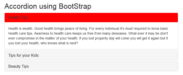
change heading background color of Accordion
<!DOCTYPE html>
<html xmlns="http://www.w3.org/1999/xhtml">
<head>
<title>How to change heading background color?</title>
<meta name="viewport" content="width=device-width, initial-scale=1" />
<link rel="stylesheet" href="http://maxcdn.bootstrapcdn.com/bootstrap/3.3.4/css/bootstrap.min.css" />
<script type="text/javascript" src="http://code.jquery.com/jquery-2.1.4.min.js"></script>
<script type="text/javascript" src="http://maxcdn.bootstrapcdn.com/bootstrap/3.3.4/js/bootstrap.min.js"></script>

<style type="text/css">
/*Making the accordion full screen*/
.container {
width: 100% !important;
}
/*Active class for the default open tab background color*/
.active {
background-color: red !important;
}
</style>

<script type="text/javascript">
/*Implemented by: https://jharaphula.com, Dated:19th May 2015*/
$(document).ready(function() {
/*All header links Click events*/
$('.accordion-toggle').click(function() {
/*In Anchor tag Click first resetting all the background colors & padding to hack the BootStrap look n feel*/
$('.accordion-toggle').parent().css('background-color', '#f5f5f5');
$('.accordion-toggle').parent().parent().removeClass('panel-heading');
$('.accordion-toggle').parent().css('padding', '10px 15px');
/*If the respective content panel is visible, updating its background color*/
if (!$($(this).attr('href')).is(':visible')) {
$(this).parent().css('background-color', 'red');
} else {
$(this).parent().css('background-color', '#f5f5f5');
}
});
});
</script>
</head>
<body>
<div class="container">
<h2>Accordion using BootStrap</h2>
<div class="panel-group" id="accordion">
<div class="panel panel-default">
<div class="panel-heading active">
<h4 class="panel-title">
<a class="accordion-toggle" data-toggle="collapse" data-parent="#accordion" href="#panel-1">Health Tips</a>
</h4>
</div>
<div id="panel-1" class="panel-collapse collapse in">
<div class="panel-body">
Health is wealth. Good health brings peace of living. For every individual it's must required to know basic Health care tips. Awareness to health care keeps us free from many diseases. What ever it may be don't ever compromise in the matter of your health. If you lost property day will come you will get it again but if you lost your health, who knows what is next?
</div>
</div>
</div>
<div class="panel panel-default">
<div class="panel-heading">
<h4 class="panel-title">
<a class="accordion-toggle" data-toggle="collapse" data-parent="#accordion" href="#panel-2">Tips for your Kids</a>
</h4>
</div>
<div id="panel-2" class="panel-collapse collapse">
<div class="panel-body">
Kids are our next Generation. In this world the most difficult job is to build a Kids. From education to food you need to take care all. Minor mistake in the matter of your Kids can destroy them. Teach them behavior, manners, attitude and how to be a successful social element. Education is the eyes for Kids. Prepare your Kids such a way that he or she to be an ideal for others.
</div>
</div>
</div>
<div class="panel panel-default">
<div class="panel-heading">
<h4 class="panel-title">
<a class="accordion-toggle" data-toggle="collapse" data-parent="#accordion" href="#panel-3">Beauty Tips</a>
</h4>
</div>
<div id="panel-3" class="panel-collapse collapse">
<div class="panel-body">
Today Beauty Tips are on demand. A beauty always want to look more n more beautiful. From makeup to costume beauties are thirsty. There some techniques using which you can look gorgeous. Experts know this. If you are interested to know such brilliant beauty tip read latest beauty tips related sections. This habits give better idea to decorate you better. Beauty tips is also helpful to take care of your skin. While you do apply beauty tips on you always give first priority to take care of your Skin.
</div>
</div>
</div>
</div>
</div>
</body>
</html>
How Bootstrap Accordion Works
An accordion consists of multiple panels, each containing a header and a content section. By default, only one panel is expanded at a time, though this behavior can be customized. When a user clicks on a panel’s header, its content becomes visible while other panels collapse. This interaction is managed using JavaScript and CSS transitions, ensuring smooth animations.
Key Features of Bootstrap Accordion
Bootstrap Accordion is a powerful component that allows developers to create collapsible content sections, improving user experience by organizing information in a compact and interactive manner. Built on top of Bootstrap’s robust framework, the accordion is widely used in web development due to its flexibility, ease of implementation, and adaptability across different devices. Below, we explore the key features that make Bootstrap Accordion an essential tool for modern web design.
Responsive Design
One of the standout features of the Bootstrap Accordion is its inherent responsiveness. The component automatically adjusts to different screen sizes, ensuring a seamless experience across desktops, tablets, and mobile devices. This responsiveness is achieved through Bootstrap’s grid system and CSS media queries, which dynamically resize and reposition accordion elements based on the viewport dimensions.
For instance, on smaller screens, the accordion collapses into a vertical stack, preventing horizontal overflow and maintaining readability. This eliminates the need for additional JavaScript or custom CSS to handle responsiveness, saving development time and effort. Whether users access the website on a smartphone or a large desktop monitor, the accordion remains functional and visually consistent.
Customizable Styling
Bootstrap Accordion offers extensive customization options, allowing developers to tailor its appearance to match the website’s design language. The default styling is clean and minimal, but with Bootstrap’s utility classes and SASS variables, it can be easily modified.
Developers can adjust colors, borders, spacing, and animations to create a unique look. For example, the background color of the accordion header or the transition effects when expanding and collapsing sections can be customized using predefined classes or custom CSS. Additionally, Bootstrap’s theming capabilities enable the accordion to align with brand-specific color schemes effortlessly.
For those who require more advanced styling, overriding default styles via SASS or CSS ensures complete control over the component’s visual presentation. This flexibility makes the accordion suitable for a wide range of applications, from corporate websites to creative portfolios.
Accessibility
Accessibility is a critical consideration in modern web development, and Bootstrap Accordion is designed with inclusivity in mind. The component adheres to WAI-ARIA (Web Accessibility Initiative – Accessible Rich Internet Applications) standards, ensuring compatibility with screen readers and keyboard navigation.
Key accessibility features include proper ARIA attributes such as `aria-expanded` and `aria-controls`, which provide context to assistive technologies. The accordion also supports keyboard interactions, allowing users to navigate between sections using the Tab key and expand or collapse content with the Enter or Spacebar keys.
Furthermore, Bootstrap ensures that focus states are clearly visible, enhancing usability for individuals who rely on keyboard navigation. By following these best practices, developers can create accordions that are accessible to all users, including those with disabilities.
Easy Implementation
Bootstrap Accordion is designed for simplicity, making it easy to integrate into any project. The component leverages Bootstrap’s pre-built classes and JavaScript plugins, reducing the need for extensive coding. A basic accordion can be set up with just a few lines of HTML and minimal configuration.
The structure consists of a parent container with the `.accordion` class, followed by individual accordion items containing a header and a collapsible body. Bootstrap’s JavaScript handles the toggle functionality automatically, eliminating the need for custom scripts. For more advanced implementations, developers can use the Bootstrap JavaScript API to control accordion behavior programmatically.
Additionally, Bootstrap’s comprehensive documentation provides clear examples and code snippets, enabling even beginners to implement accordions quickly. This ease of use makes it an ideal choice for projects with tight deadlines or limited development resources.
Conclusion
The Bootstrap Accordion is a powerful tool for organizing content in a user-friendly manner. Its flexibility, ease of use, and responsiveness make it a preferred choice for developers. By following best practices and leveraging customization options, you can create efficient and visually appealing accordions that enhance the overall user experience. Whether for FAQs, product descriptions, or complex navigation, the Bootstrap Accordion remains a reliable solution for modern web development.