Compare to JavaScript or a JQuery menu pure CSS menu gives better performance. Are you looking to create a horizontal menu with sub-menu for your web applications without using any third-party plugins? If so this example will help you. In this demo app we Created a responsive horizontal navigation menu using pure CSS. This menu works for all browsers like Google Chrome, Firefox and Safari. You can customize this source codes as per your business need.
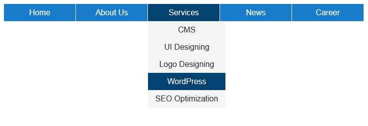
Desktop View:
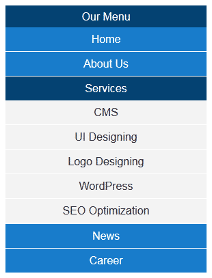
Mobile View:
Example of Menu with Sub-menu using pure CSS
In this example I have tabs like Home, About Us, Services, News & Career. You can add or update tags as you want. This menu is supporting sub menu feature. Under About Us & Services I added some sub menu items for demo purpose.
Technically to design this horizontal menu I used UL element of HTML. Using pure CSS I am defining color & theme to the menu. For responsive I used CSS3 media queries. In media query I configured the menu max-width to 750px. 750px is nothing but the total width of my horizontal menu (including all tabs).
This menu is designed using pure CSS, so according to your requirement you can Configure this menu easily. You can change width, height, font style, font color or font size as you want. To update colors & theme you can update background for li & anchor elements. To present mouse over effect here I used CSS hover. To update hover related changes you need to update li:hover related classes.
Horizontal Navigation menu with sub-menu
<!DOCTYPE html>
<html xmlns="http://www.w3.org/1999/xhtml">
<head>
<title>Responsive horizontal menu using CSS</title>
</head>
<body>
<label for="display-menu" class="our-menu">Our Menu</label>
<input type="checkbox" id="display-menu" role="button" />
<ul id="hor-menu">
<li><a href="#">Home</a></li>
<li>
<a href="#">About Us</a>
<ul class="sub-menu">
<li><a href="#">Our Mission</a></li>
<li><a href="#">Technology</a></li>
<li><a href="#">Success Stories</a></li>
</ul>
</li>
<li>
<a href="#">Services</a>
<ul class="sub-menu">
<li><a href="#">CMS</a></li>
<li><a href="#">UI Designing</a></li>
<li><a href="#">Logo Designing</a></li>
<li><a href="#">WordPress</a></li>
<li><a href="#">SEO Optimization</a></li>
</ul>
</li>
<li><a href="#">News</a></li>
<li><a href="#">Career</a></li>
<li>
<a href="#">Products</a>
<ul class="sub-menu">
<li><a href="#">Off-page Optimization</a></li>
<li><a href="#">Blog Writing</a></li>
<li><a href="#">MyCMS</a></li>
<li><a href="#">WordPress Blogs</a></li>
<li><a href="#">Mobile Apps</a></li>
</ul>
</li>
</ul>
</body>
</html>
CSS Source Code for Navigation menu
<style type="text/css">
.our-menu { font-family: Arial, "Times New Roman", Georgia; text-decoration: none; color: #ffffff; background: #054372; text-align: center; padding: 6px 0; display: none; }
#display-menu { display: none; }
#display-menu:checked ~ #hor-menu{ display: block; }

/*Style for horizontal CSS menu*/
ul { list-style-type:none; position: absolute; margin:0px; padding:0px; }
li { float: left; margin-right: 1px; display:inline-block; }
li a { display: block; text-decoration: none; height: 35px; min-width: 145px; text-align: center; line-height: 35px; font-family: Arial, "Times New Roman", Georgia; color: #ffffff; background: #197DCB; }
li:hover a { background: #054372; }
li:hover ul a { background: #f3f3f3; color: #2f3036; line-height: 35px; height: 35px; }
li:hover ul a:hover { background: #054372; color: #ffffff; }
li ul { display: none; }
li ul li { display: block; float: none; }
li ul li a { width: auto; min-width: 120px; padding: 0 15px; }
ul li a:hover + .sub-menu, .sub-menu:hover { display: block; }

/*Media Query for Responsive Design*/
@media screen and (max-width : 750px){
.our-menu { display:block; }
ul { position: static; display: none; }
li { margin-bottom: 1px; }
ul li, li a { width: 100%; }
}
</style>